Desktop is Dead*
Length: • 21 mins
Annotated by Frank
April 21, 2025 · 5529 words · 26 minutes
TL;DR for HackerNews
READ THE FUCKING THING; DON’T COMMENT JUST BECAUSE OF THE TITLE YOU SIMPLETON
Windows. Icons. Menus. Pointers. All things that taught an entire generation how to compute. What started as groundbreaking research by Doug Engelbart, implemented at Xerox with the Alto, bought by Apple and made into the Macintosh is now an expected standard everywhere.
But the truth is
*okay it’s not dead but how else am I to try to get on the front page of Hacker News?
... and I say that as someone who used Suckless’ st, dwm, surf with tabbed, slock and dmenu. But even then, I am humble enough to accept that the times have changed. People do not compute how they used to, and my generation is apt to blame (I got that gen z dawg in me fr fr.)
Android and iOS together have a 63.65% market share, 146% more than Windows. Mobile is now at a point where users are more likely to use their phone or tablet than a desktop. Why?
The desktop metaphor, first in the Xerox Alto and then the Macintosh, is now 52 years old. It was a good solution to the problem of making non-technical knowledge workers use the computer effectively. But the real fact is that the desktop metaphor has died. My generation wasn’t alive to experience marking up paper and putting it into a file folder. We were just taught how to use a computer!
However, the metaphor is still in use, and I’d argue that it is something that is limiting the power of computers. Computers transcend physical limitations, the metaphor does not. Hypertext, shortcuts, the cloud and other inventions do not exist in the real world, yet give you immense power and flexibility. Computers are stuck in a past that does not exist and refuse to grow out of it. Modern technology shouldn’t merely match our ancient technology — it should surpass it.
The so-called ‘desktop metaphor’ of today’s workstations is instead an ‘airplane-seat’ metaphor. Anyone who has shuffled a lap full of papers while seated between two portly passengers will recognize the difference—one can see only a very few things at once.
— Frederick P. Brooks, Jr. (source)
We started describing cars like horses but better, and only then did we realize that they are their own unique thing and need to be treated and taught differently. And later, we got a generation that grew up with cars and regarded them as something entirely separate from horses, and we could use cars as metaphors. Perhaps it’s time to do the same thing with computers?
Instead of saying “this works like paper” just like the desktop metaphor, maybe we could design a completely new experience? Categorizing computers as their own special tool, with specialized properties that do not exist anywhere else?
So, how would a new desktop look like? If we were given the change to redesign how people would interact with computers as a whole, what would we end up with?
While I do not have a specific design, I would like to present a few concepts, ideas and examples that have stuck with me. I hope presenting these ideas will make you think how limited current operating systems are, and how they could be improved. If anything, this should serve as an invitation to a very big rabbit hole.
Quick interlude #
To understand how to design something, we need to know how it will be used.
To paraphrase Steve Jobs’ great “Bicycle for our minds” analogy, the primary function of a computer is to augment human intellect. Computing finance numbers on paper is doable, but it is much faster in a spreadsheet.
The design should also go with all of our biological strengths and weaknesses. We have great innate spatial reasoning, instantaneous and effortless eye movement, intrinsic pattern recognition and correlation. But we also have some weaknesses, namely the one-dimensional, uncontrollable auditory system, the relatively sluggish motor system, and the mind’s limited capacity to comprehend hidden mechanisms.
The user should also spend as little time as possible doing mechanical tasks. Tedious, boring or repetitive tasks are prime candidates for agents and daemons to handle instead of the user. The user should spend as much time thinking and acting as possible. If the computer can do a job better than us, it should, and as programmers, we have learned this very early with assemblers, compilers, and interpreters.
J. C. R. Licklider, called “the father of it all” explains it best:
In the spring and summer of 1957... I tried to keep track of what one moderately technical person [myself] actually did during the hours he regarded as devoted to work... About 85 per cent of my “thinking” time was spent getting into a position to think, to make a decision, to learn something I needed to know. Much more time went into finding or obtaining information than into digesting it. Hours went into the plotting of graphs, and other hours into instructing an assistant how to plot. When the graphs were finished, the relations were obvious at once, but the plotting had to be done in order to make them so... Throughout the period I examined, in short, my “thinking” time was devoted mainly to activities that were essentially clerical or mechanical: searching, calculating, plotting, transforming, determining the logical or dynamic consequences of a set of assumptions or hypotheses, preparing the way for a decision or an insight.
— J. C. R. Licklider (source)
From a GUI design standpoint, the interface should give the user as much information as possible. The human eye can scan dense (but comprehensible, use different text weights!) information faster than an arm can click a link, thus the user should interact with the interface the least possible.
Fuck go back (to PARC) #
It is only appropriate we start at the foundation, and that is the operating system. It still baffles me that nothing like “a new Xerox Alto” has been attempted. The entire operating system is written in one language called Smalltalk, from rendering to user-facing applications. This also meant the entire system could be modified while running faster than a second, and every object in the system could be inspected and changed.
Smalltalk is message-oriented (back in the day it was called object-oriented before C++ stole that label) — everything in a system is an object, and these objects pass around messages. Instead of an object being data with functions attached, an object functions like a biological cell, is completely autonomous (i.e. like a process on Unix), and communicates by sending and receiving messages.
This makes everything dynamic and self-describing. It also means that there is no difference between a client or resource on the same machine and on a different machine, both respond identically and asynchronously.
Plan 9 from Bell Labs abstracted everything (actually everything, unlike Unix) into a file, e.g., if you want to start a TCP connection, you write into /net/ether0. Entire problem spaces like VPN protocols now disappear because you can just mount someone else’s ether0 as your ether1 and use it like it’s on your machine.
If you take files and abstract even further, you’re going to get to a universal message/object protocol eventually. If you go one step further, you realize you have encapsulated a computer, every object is simply like a web server that can choose to respond to a message. It’s servers all the way down (and up.)
Nerd shit detailsYou don’t even need a new language for that; the BEAM VM that Elixir runs on top of has everything you need: hot reloading, objects as processes, messages. We have all the technology, improved, but no one has taken the time to connect the dots.
Also, try programming something in Smalltalk or its successor Squeak. Glamorous Toolkit has a nice short video explaining Smalltalk’s syntax.
Existing languages make it easy to fall into a Pit of Despair, as they do a terrible job of protecting you from your own worst enemy — yourself. But wouldn’t it be nice if the language made it hard (or even impossible) to make catastrophic failures? And wouldn’t it be even better if the language made it effortless to fall into the Pit of Success? A well-designed language (or any system or OS for that matter) makes it easy to do the right things and annoying to do the wrong things (even a chair should make it hard to sit with bad posture).
[Rico] admonished us to think about how we can build platforms that lead developers to write great, high performance code such that developers just fall into doing the “right thing.” That concept really resonated with me. It is the key point of good API design. We should build APIs that steer and point developers in the right direction.
— Brad Abrams (source)
Of course, implementing a new language and OS isn’t necessary, but a good foundation makes everything else I’m going to talk about way easier. The operating system knowing about all the text fields on screen without requiring applications to use a library means that absolute magic is possible.
Imagine a keyboard, like the one the Canon Cat had, that had keys under the space bar that turned the entire operating system into vim. For example, you could simply hold the key and type what text you want to focus on, just like search in Vim. Implementing such behavior would be way easier in such a system.

Item based #
Other people have described itemized operating systems way better than me, so here is an excerpt from The Potential Merits of an Itemized OS by Alexander Obenauer.
For the purposes of illustration, this section is a narrative, about a friendly fellow named Joe.
Joe is a freelance copywriter who uses his itemized operating system throughout his day for both his work, and his general engagement with learning and exploring the world.
One Monday morning, Joe begins his day with a podcast episode he had queued up the night before, on a topic he has been exploring recently. He begins to play the episode, and during its intro, he creates a new note that he drags the podcast episode into. As the episode delves into deeper discussion, he begins typing his thoughts in the note, below the episode.
He can pause and play the episode as he develops his own thoughts, because the episode he dragged into his note is not a link, but rather it is the episode itself, as rendered by his chosen podcast player. He can see and interact with everything related to that episode within his note. In the future, whenever he returns to his note, it will come with the episode intact.
As the early-morning hours turn closer to the workday, Joe pulls up his day’s to-do list. The first thing he needs to do is draft an email to one of his clients with a project proposal he has been preparing. With half of the email drafted, Joe realizes it’s too important of an email to send without having had some coffee first. Instead of sending the email-in-progress, he drags the draft into his day’s to-do list. Later, he can open the draft directly from his list to finish up before the day is done.
After starting a pot of coffee, Joe begins to prepare for a call with another client. He arranges a series of resources he’ll need on a two-dimensional canvas within his system. He arranges items — some example articles, a language flashcard exercise, and a few worksheets — loosely based on when during his call he will refer to them. Conducting the workshop with his client will only require him to share this one canvas of items, rather than sending along many disparate resources and links of different types.
Next to his day’s to-do list, Joe starts a daily note. Since he does this every day, he made a special view for himself to take his daily note within. He was able to construct the component himself, using a drag-and-drop tool within the system. This allowed him to add fields for each of the things he likes to cover in his daily note (besides some space for reflection and ideating, he has a simple habit tracker component, among other things).
— Alexander Obenauer (source)
An itemized OS is simply filled with “things”: notes, tasks, emails, photos, events, calendars, meetings, etc. These things are all related to each other (e.g., a calendar event is for a meeting with these contacts about this issue previously discussed in this email), but current operating systems and services isolate these from each other. However, an itemized operating system builds upon the idea that everything is an item and allows intricate cross-referencing.
Many other benefits, such as nonvolatile discrete workspaces and composable views, also follow from this, but if this interests you, I cannot recommend reading the source article enough.
One interesting idea that goes hand in hand with an itemized OS is that programs do not own the data, they are only responsible for drawing and manipulating it. The user is capable of switching how the content is displayed, and is capable of making their own ways of displaying data. This is also more accessible, as a blind user can have a view that outputs to a braille display that other views might not support.
Searching #
Files in directories is also an old analog, although this one has served us well, but that doesn’t mean we can’t do better. Items should be able to appear in multiple places at the same time, and not be constrained to a single hierarchical location.
One obvious modification is to allow tagging files, just like one might tag a tweet. Searching for #family would return contacts, mail, and photos with the same tag. A universal metadata storage mechanism should be implemented on the file system, such as was the case on BeOS’s BFS.
One of BFS’s most important and widely touted features is its support for extended attributes. An example of the importance of attributes is illustrated with an example of MP3 files. Information fields important to an MP3 file would be: song title, band, album, release date, encoding rate, length, number of times played. If you want to associate this information with each MP3 file using a conventional file system, you might have to create your own database to support searching, creating, updating, or deleting these attributes as your music collection grows and changes. With BFS, in contrast, these attributes, or any other attributes, can be added to the file system itself. This means that a program for editing or playing MP3s does not need to create or maintain a database, because the file system will handle these functions for you. BFS supports associating attributes with a file, either under program control or from the command line. Attributes can be searched and sorted by the file system, as an extension of any application. How this is done will be discussed in detail later.
— Andrew Hudson (source)
Such a computer should act more as a secretary, knowing why certain files are important and why, their connections to people or other documents, and where they are stored. A better, connected search might allow you to search for the phone numbers of all people tagged in a document, without you having to find all of them manually.
Inputs #
Eye tracking is probably the most underrated input method, but I’d argue one of the best. Your eye can move way faster than your arm, and subconsciously goes exactly where you want it to go. Notifications could be automatically dismissed after you look at them, as they already fulfilled their purpose when you looked at them. Looking is way faster than navigating with a mouse or cursor keys. I would, however, caution against making eye tracking have gestures, e.g., looking in the top left corner of your monitor opens a window overview. Eye movement should not trigger actions directly, but keyboard input with the context of eye tracking should.
New input methods must be implemented to allow for their full potential. For example, when using a pen or drawing tablet to interact with a point-and-click desktop, actions that are rather simple, such as double-clicking on an icon, become awkward. The dexterity and power of a pen go wasted.
Even current input devices can be used more effectively. For example, let’s consider something like the pie menu in Fusion 360. When I select something while editing a sketch, I can right-click and get a radial menu with options. This is already faster than clicking the same operation, but if I want to do it even faster, I can just hold the right mouse button and drag. This won’t open the pie menu but will still select the option in that spot.
A touchpad could also be used more effectively. Larger, mobile-like gestures could be implemented, making navigating even easier. As the touchpad is below a keyboard, reaching for it is faster than reaching for a mouse.
Language and Voice #
As humans, we have spent over a million years developing language, making every other species on this planet jealous. And yet, the classic see-and-point architecture of today’s desktops reduces our complex language to a few basic grunts. Our languages have developed far enough that we can talk about things that happened or are going to happen, with words that signify abstract that may not be in the immediate environment. Language written on a permanent medium might as well constitute temporal telepathy.
Contrast that to how we interact with our desktops. Pointing and gesturing at a restaurant menu in a country whose language you don’t speak will work, but it won’t get you far. But language allows us to discuss exactly what we would like to eat with the waiter or chef. Adding language to the interface allows us to use a rich vocabulary and gives us basic linguistic structures such as conditionals.
Simply writing “files over a week old” into a search bar should return, well, files over a week old, automatically setting the filters in a file explorer. Better processing of language will allow more complex conditionals and make it possible to make the computer automatically do things in the future. More complex commands, such as “Move all emails from Maggie into the Work folder, make a new tag called HR, and add it to them” should do exactly what the user requested.
A decent implementation could also converse with the user, letting them fine tune the query if it is imprecise, just like a librarian might ask you a few questions to understand you actual query. And then such an implementation might save this into memory, so that if the user asks the same fuzzy question, it mixes elements from the original fuzzy search and the precise altered search from last time.
As a system built like the Xerox Alto is self-describing, the operating system will almost certainly know more than the user. This is why I emphasized a better foundation for such a desktop, it makes everything on top easier to implement and use.
Of course, in our modern time, we (fortunately/unfortunately, depending on your view) have LLMs and computers powerful enough to run them locally, so much of the problem of parsing language has been solved. That, however, doesn’t mean that ChatGPT should be shoved into everything, only that a fine-tuned LLM should be used to parse the natural query into commands. Voice and language should also not replace other input methods, simply augment them.
Context #
Applications should also use as much context as possible to ease the user experience. Such context comes from three places: the physical environment (time, location), the user’s interaction history, and the current session’s inputs.
Take, for example, a simple application that plans routes using public transport. It can use context in many ways to empower the user and make itself more useful, saving the user mental energy and time. When the user opens it, they probably want to go somewhere from where they are right now, so you default the from field to their current location. The application remembers the user frequently travels from place A to place B in the morning, and from place B to place A in the evening. So, it can suggest, prefetch, or even just show these routes, as they might be what the user is looking for. When searching for stops, it should order from closest to farthest, with the recently searched on top.
So now we have an application that uses local context, but what about context between applications? Say a friend messages you if you want to grab pizza, how should that get to the map application, and how should it then suggest looking at close-by pizza places?
This is still an open question as I have not seen it implemented successfully, however, an operating system might store this global context just like it stores the clipboard.
All software lives within an environment, rich with evidence of context. Using software that doesn’t look outside itself is like conversing with a blind person—constantly describing what is plainly visible.
— Bret Victor (source)
GUI frameworks #
This could be an entire article on its own, so I’ll just point you to A New Architecture for a GUI Framework by Gavin D. Howard.
Nevertheless, current GUI frameworks are often limiting and lack the flexibility one would expect when designing complex interfaces. It took 11 years for CSS to develop Grid, and only then was CSS and HTML able to achieve the so-called Holy Grail layout that newspapers have relied on for decades. Now that Flexbox and Grid have been invented, responsive websites have finally started emerging.
Graphical interfaces are so plain and unobtrusive in their design, they are sometimes outright unusable. Yes, you can visualize everything as a table, but that doesn’t mean you should. Paper looks like a massive table because it does not change, as soon as it is printed the ink stays where it is, but computers, again, transcend these limitation but currently do not take advantage of how limitless the possibilities are.
Let’s consider an interface for browsing nearby movie showings (example taken from Magic Ink by Bret Victor):
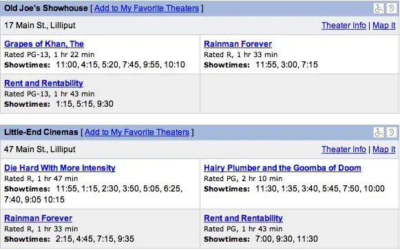
This is horrible, unreadable, ugly. It doesn’t even work for the user. Here is what the user wants to know: What movies are showing today, and at what time? Where are they showing? What are they about? Are they good?
Let’s consider a redesign that caters especially to those questions.
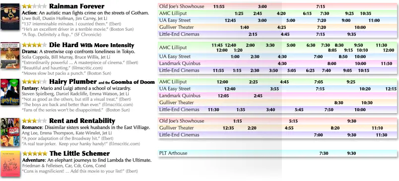
Enough information is given about each movie to determine its content and quality. Text weight is employed to make critical information stand out and supplementary information disappear until focused upon. The timeline on the right plots movie showings by time. To find all movie showings around a particular time, the viewer simply scans their eye vertically down the page.
Instead of specifying how content should look on a paper, why not specify the intent of the content? For example, this is a header, it should be large on a web page and also italic if it’s being printed. Websites already do this - HTML specifies intent, absent from any restriction on how it should be displayed. Specifying intent is also more accessible. Writing <h1> or \chapter tells a screen reader way more than Calibri, 24pt, centered.
A good GUI framework should also allow the user to bootstrap: use what they build to boost their own effectiveness. A good user will inherently change their processes and systems to make their work easier, but they just can’t. Instead of forcing them to grow, we just need to remove what stops them. As programmers, we do this automatically - bash scripts, aliases, and PRs to FOSS software. The only reason the average user doesn’t make their enviroment more conducive to work is because they just can’t.
Zooming or rolling? #
Two new design paradigms have emerged as successors to windowed desktops. One lays out all windows on an infinite scrolling canvas, and the other on an infinite two-dimensional canvas.
A scrolling interface places all content on an infinite scrolling canvas. More advanced interfaces may let you have multiple of these, and will let you put content in a grid. In fact, you have probably used a scrolling interface today: your phone. The app management on Android and iOS is essentially an infinite list of applications you can open, close and switch between.
A Zoomable User Interface lays out content on an infinite, two-dimensional canvas. You can drag items around, zoom in and out, and fullscreen certain items.
The innate advantage of both of these is that the views can be non-volatile. You could open your canvas at any time in the future, and everything would be there like you left it.
I am of the opinion that the zooming interface is better, as it scales down to mobile and up to VR exceedingly well. On mobile, you can simply click an item, which will fullscreen it, and swipe up to bring it out of view, just like apps on current mobile operating systems. But it also scales up, as you can forgo the metaphorical canvas in AR and position either the entire canvas or items around you. But they are both equivalent in function and it would be possible to switch between them at any time.
Connected devices #
I’ve already thrown a few hot takes, so why not add one more? I actually quite like the integration that Apple has achieved. Sending and receiving files, instantly pairing, synchronization between a plethora of devices (who would have thought you could call on a watch, even a few years ago?), natively streaming your phone’s camera feed to your desktop, extending your desktop to your iPad, etc.
To bring an earlier point back, having all content (and code) addressed by a single protocol makes such integration much easier. Again, there isn’t really a difference whether the object is on your local machine or not, messages work the same. You could even share computing workloads between computers, a search started on mobile could be run on your desktop to speed it up, complex applications could be offloaded from VR to a powerful desktop, and the results streamed back to the headset.
Nerd shit details againAgain, working with the BEAM VM you could use OTP to make this way easier. It allows you to share processes amongst many different computers, transparently.
Most of what one would need to implement such integration already exists and is in use. Take Cloud sharing, but only between your local devices. We have most of the infrastructure, but divided between different operating systems and applications.
There are people trying #
There are people already trying to move away from the desktop metaphor. The previously mentioned Alexander Obenauer has done great work and has written about it on his blog. For example, take Ollos, his itemized personal computing timeline. Not a full operating system, but it does demonstrate the merits of an itemized approach.
He also has a series he calls “Lab Notes”, where he talks about designing such an operating system.
There have also been numerous concepts designed, such as the Desktop Neo or Semilattice. Semilattice is also a great example of both a ZUI and a item-based system.
And of course, you can daily drive the scrolling compositor Niri.
This isn’t fantasy; this was the computer’s destiny #
I am surprised more people don’t know about Douglas Engelbart. Out of all the pioneers in computer science, he has to be the most underappreciated. His inventions are, you know, just the computer mouse (and using the word mouse to refer to the thing), hypertext, networked computers, and The Mother of All Demos. In The Mother of All Demos, he shows off essentially collaborative word processing in Google Docs with his homeboy Bill English while in a Discord group chat with cameras on in NINETEEN SIXTY EIGHT. This was when Nixon got elected for his second term, and before we even got on the moon.
In one of his works, Toward Augmenting the Human Intellect and Boosting our Collective IQ, he is describing exactly what an itemized operating system is today. This isn’t some weird fantasy about how a computer should work, this is how it was meant to work. He describes things that computers still do not do, for example:
Everything in the Work Environment is Live Hyperdocument Stuff: All knowledge products, such as email, notes, source code, to-do lists, work breakdown structures, status reports, design documents, user guides, trouble reports, and others are inherently hyperdocument objects. The infrastructure provides knowledge products with all the hyperdocument capabilities described here.
Integrated Applications: A tool system using a universal knowledge base replaces the standard application or function-based paradigm. Individual application subsystems (graphical editors, program language editors, spreadsheets) work with knowledge products, but do not “own” hyperdocuments in the sense of being responsible for their storage or representation. For instance, one could create a Gantt chart within a project management system, and manipulate it as a graph in a charting application or as mail in an email application. An integrated core application package provides base capabilities of composing, reading, annotating, linking and manipulating knowledge products. All knowledge workers – authors and users – modify and incorporate other knowledge products into their own information bases and knowledge products (much as Ted Nelson advocated in Xanadu).
View Control of Form, Sequence and Content: A structured, mixed-object hyperdocument may be displayed with a flexible choice of viewing options: selective level clipping, filtering on content, truncation or other transformation of object content, new sequences or groupings of objects including those residing in other documents, etc. Links may specify views so traversal retrieves the destination object with a prespecified presentation view (e.g., display as a high-level outline or display only a particular statement). View specification becomes a natural and constantly employed part of a user’s vocabulary.
Some of his vision, like universal links exist (URLs), but most of the more fundamental parts don’t. Today’s computers and programmers would need a monumental paradigm shift. For example, from programs owning, storing, and representing documents (Photoshop completely separate and only using one proprietary file format), to documents with embedded files that describe how they should be represented (a document with an embedded file with an open format that the user can choose how it should be represented and modified).
Conclusion #
I hope I have made you interested in how a new operating system could be designed to help the user. Windows, as some have pointed out already, feels adversarial to use and feels hostile to the user. Ever since Microsoft purchased itself a monopoly with their shady business tactics (e.g., EEE, incentivizing OEMs to only sell DOS machines), an entire field of computer science died. It is sad to see people around me complain how unintuitive the desktop is while being able to do everything on their phone, because desktops could be so much better if people just... tried. Instead, we have amassed developers that will actively deny any kind of critique of their software.
As a closing remark, I’d like you to imagine how you would like your computer to assist you. How do you operate it? What all can it do for you? How does it save you time? What standout features and applications does it have? And furthermore, can these be implemented now? If so, why not give it a try?
Further reading and references #
- The Anti-Mac Interface
- User Learning and Performance with Marking Menus
- Magic Ink - Information Software and the Graphical Interface
- Refactoring UI
- Augmenting Human Intellect: A conceptual framework
- Patric Colin’s site about similar labs to PARC
- Why a New Operating System?
- Mercury OS concept
- Why Do We Interface?
- The BeOS file system, an OS geek retrospective
- Semilattice OS concept
- Desk UI concept
- Beyond the Desktop Metaphor in Seven Dimensions
- The Potential Merits of an Itemized OS
- Alexander’s The Lab Notes
- 10/GUI - 10 Finger Multitouch User Interface - YouTube
- The Soul of Erlang and Elixir
- The Art of the Metaobject Protocol
- Boosting Our Collective IQ: A Selection of Readings
- Dealers of Lightning: Xerox PARC and the Dawn of the Computer Age
Oh wow! You read to the end! Here’s a secret: if you append ?hn to the URL, a special TL;DR will show up! Enjoy.