8 Rules for Switching to Infield Top-Aligned Form Labels
Length: • 3 mins
Annotated by Anirudh Chaturvedi
🌟 Enjoy this premium article from the UX Movement Newsletter. Thanks for being a subscriber!
The future of form fields
Are you using left-aligned or top-aligned labels on your form fields? If so, your users aren't getting the best possible experience. Left and top-aligned labels produce more eye fixations and saccades. In other words, they make scanning information more slow and difficult.
A far better way to align your labels is to place them infield and top-aligned. The closer proximity between the field label and input creates a more cohesive relationship. The field border encapsulates the text elements to create clearer data groupings.
Therefore, designers must switch to infield top-aligned labels to optimize user scanning. However, this isn't easy to do without any guidance. There are many questions regarding the proper sizing and spacing of each field element. This article will give you eight rules to make the switch seamlessly.
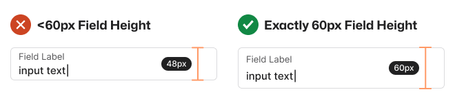
1. Text Field Height Should Be 60px
The optimal height for text fields is exactly 60px, no more or less. This height allows the label and input to have ample white space around them. Making the height less than 60px squeezes the label and input too tightly.
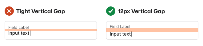
2. Text Fields Should Have a 12px Vertical Gap
You must separate the label from the input by putting a vertical gap between them. If you don't, the text will run together, making the text elements hard to differentiate.
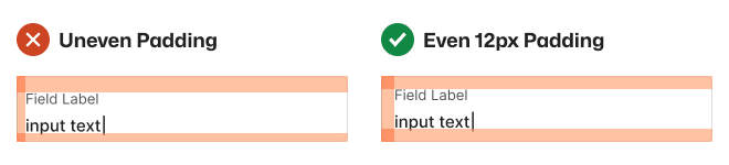
3. Text Fields Should Have an Even 12px Padding
The inner padding around the field should always be an even 12px. Uneven padding will make the label and input look odd and inconsistent.
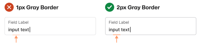
4. Text Field Border Should Be 2px Gray
A typical 1px gray border will make the field inaccessible to low-vision users, and a black border has to harsh of a contrast. Therefore, a 2px gray border is much better because it's accessible and won't distract attention from the text.
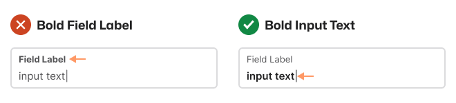
5. Input Should Be Bold, Not the Label
The user's input is more important than the label because it's the text they'll focus on when they need to edit a field. Therefore, you should use the bold font weight on the input, not the label.
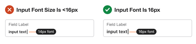
6. Input Font Size Should Be 16px
The font size of your input text should be at least 16px. If it's less than that, it'll cause mobile browsers to zoom into the field when the user selects the input. Zooming in can cause users to see only the left side of the form.
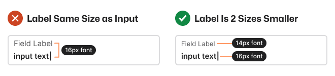
7. Labels Should Be Two Font Sizes Smaller
When the field label and input text have the same font size, it's hard for users to differentiate them. Labels should be two font sizes smaller than the input.
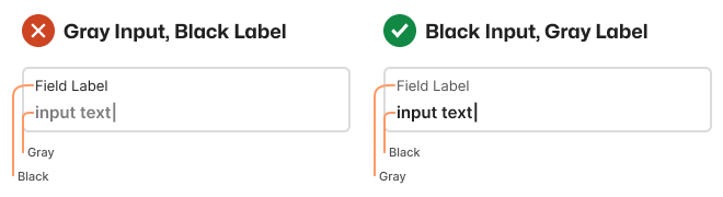
8. Input Text Should Be Black and Label Gray
Users are more likely to enter incorrect input if the text is hard to read. That's why input text should have high color contrast and be black, not gray.
Field Label Alignment Comparison
After you apply all eight rules to your text fields, you'll notice a big difference in clarity with infield top-aligned labels.
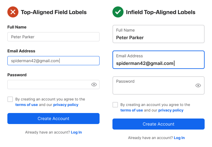
- The input is easier to scan without visual distraction.
- The labels are easier to distinguish from input.
- Every text field border is easier to see.
- Every text field is easier to select.
- Each data grouping is clear.
You have everything you need to make the switch to infield top-aligned labels. The year is 2023. It's time to leave left-aligned and top-aligned field labels in the past and look to the future.
Invite your friends and earn rewards
If you enjoy UX Movement Newsletter, share it with your friends and earn rewards when they subscribe.